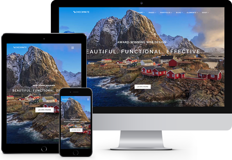
Responsive Website Development
Responsive websites look great and work well across multiple devices: desktops, laptops, tablets & smartphones.
Checkmate Productions specializes in the design and creation of stunning responsive websites that will increase traffic to your site.
Responsive design is critical because Google now uses responsive design and mobile-friendliness as a ranking criteria in its search engine results, rewarding sites that are responsive and penalizing those that are not fully optimized for mobile devices.
What is "Responsive Design"?
Responsive design means that the website is programmed so that the same code is displayed to the user regardless of the device they're using: a desktop computer, a laptop, a tablet, or one of the many smartphone brands. The website content and layout "responds" to the width of the device's screen and and re-organizes the images and content so that they fit attractively on that device. So responsive design means that the site layout "responds" to the screen dimensions on the user's device.
Advantages of Responsive Design
Responsive websites have become the "gold-standard" for business websites and offer many advantages
- Superior Search Engine Rankings - Google rarely tells web developers what it uses to rank websites. But Google considers "responsive design" to be so important that it has come right out and declared that responsive sites will receive a major boost in the search engine results, while non-responsive websites will be significantly penalized.
- Less Maintenance Required - With responsive design, you'll only need to maintain one version of your site, instead of two. Previously, when companies had a separate "mobile" version of their website (the so called "m-dot" site because it often looked like http://m.sitename.com), they had to update the regular version and the mobile version separately. What usually happened was that the mobile site didn't get updated as frequently so the information provided to mobile users was different from the info on the regular desktop version of the website.
- Improved usability on mobile devices - Every day, a higher percentage of web traffic occurs from mobile devices and a lower percentage from desktop and laptop computers. Responsive websites are attractive, easy to use, and clearly legible on mobile devices. According to the latest data, over 55 percent of consumer web traffic to major sites comes from mobile devices.